CLICK HERE TO SEE CISCO UCSD JORNEY VIDEO
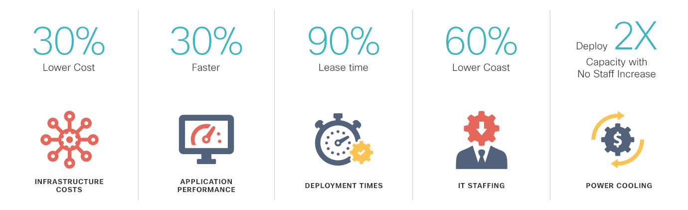
Cisco UCS Director improves consistency, efficiency, and speed within your organization. It accomplishes this by replacing time-consuming, manual provisioning and de-provisioning of data center resources with automated workflows. Cisco UCS Director reduces delivery time from weeks to minutes.
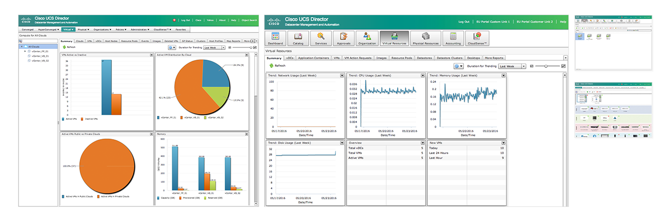
After it’s acquisition, Cloupia was branded as UCS Director and is now an important part of the Cisco UCS solution. The product features were getting a lot of attention but the UI that manages, monitors and automates workflows / orchestration was still a skeuomorphic flex based app.
This is how the flex based paginated application looked when we got started on the re-design.
In an effort to bring a better experience the Cisco Executive team decided to completely revamp the product. HTML5 based flat design was the goal.
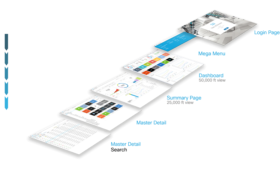
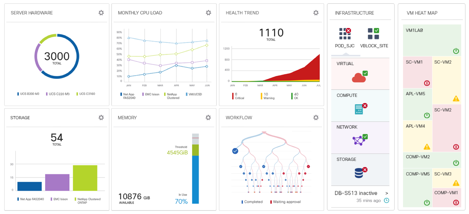
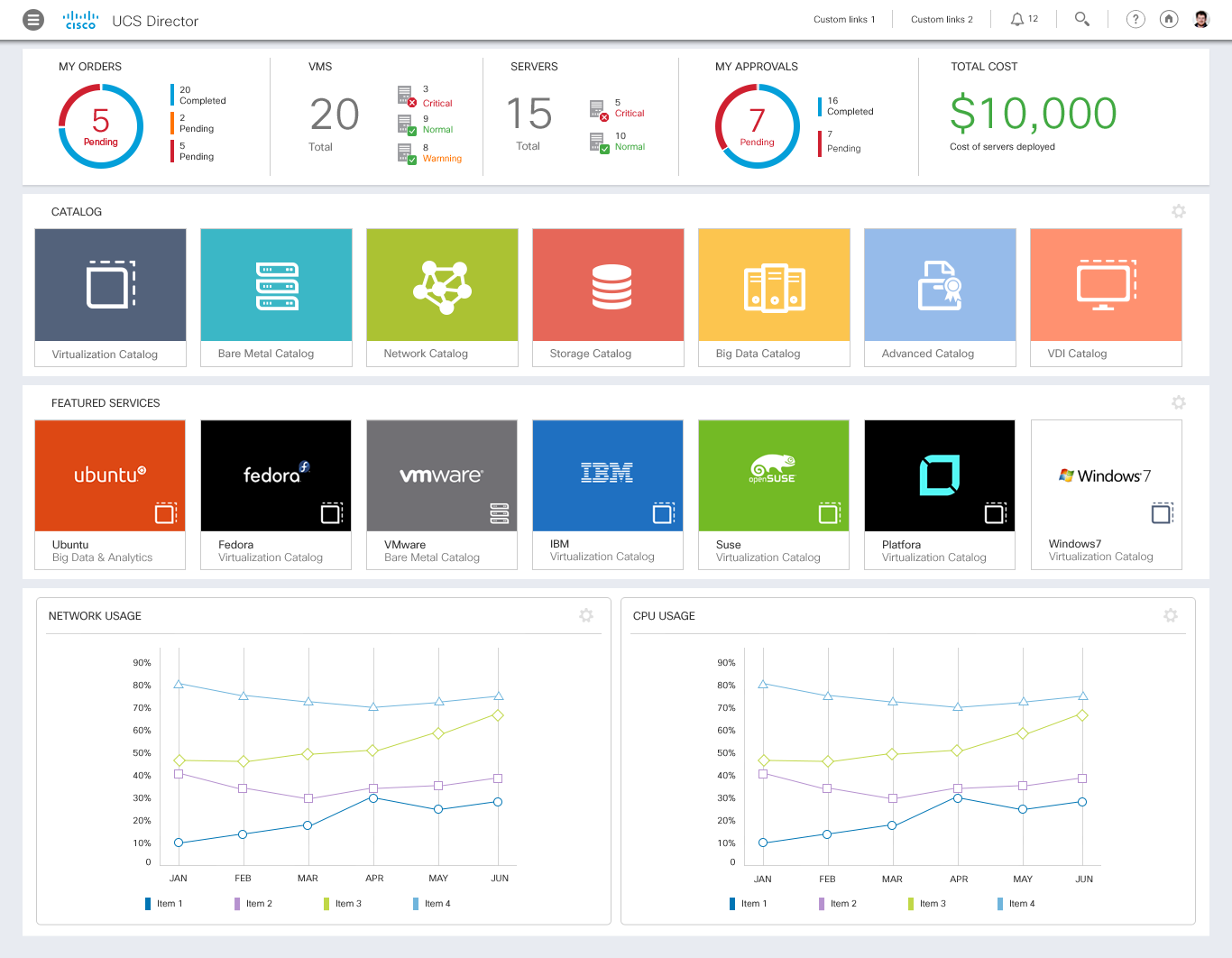
High level dashboards lead to details on contextual click-through navigation
Provides one-click navigation to the entire product
Regular and syntax search provides an efficient way for users to find their resources
UCSD has such a complex and heavy user interface it needs maximum simplicity. To achieve this, the design needs to be entirely stripped down to the minimal. A minimum amount of colors, separators, patterns, interface and chrome. The focus is the data.
To guide the redesign, we applied industry standard UX best practices to the design wireframes and interactive prototypes.
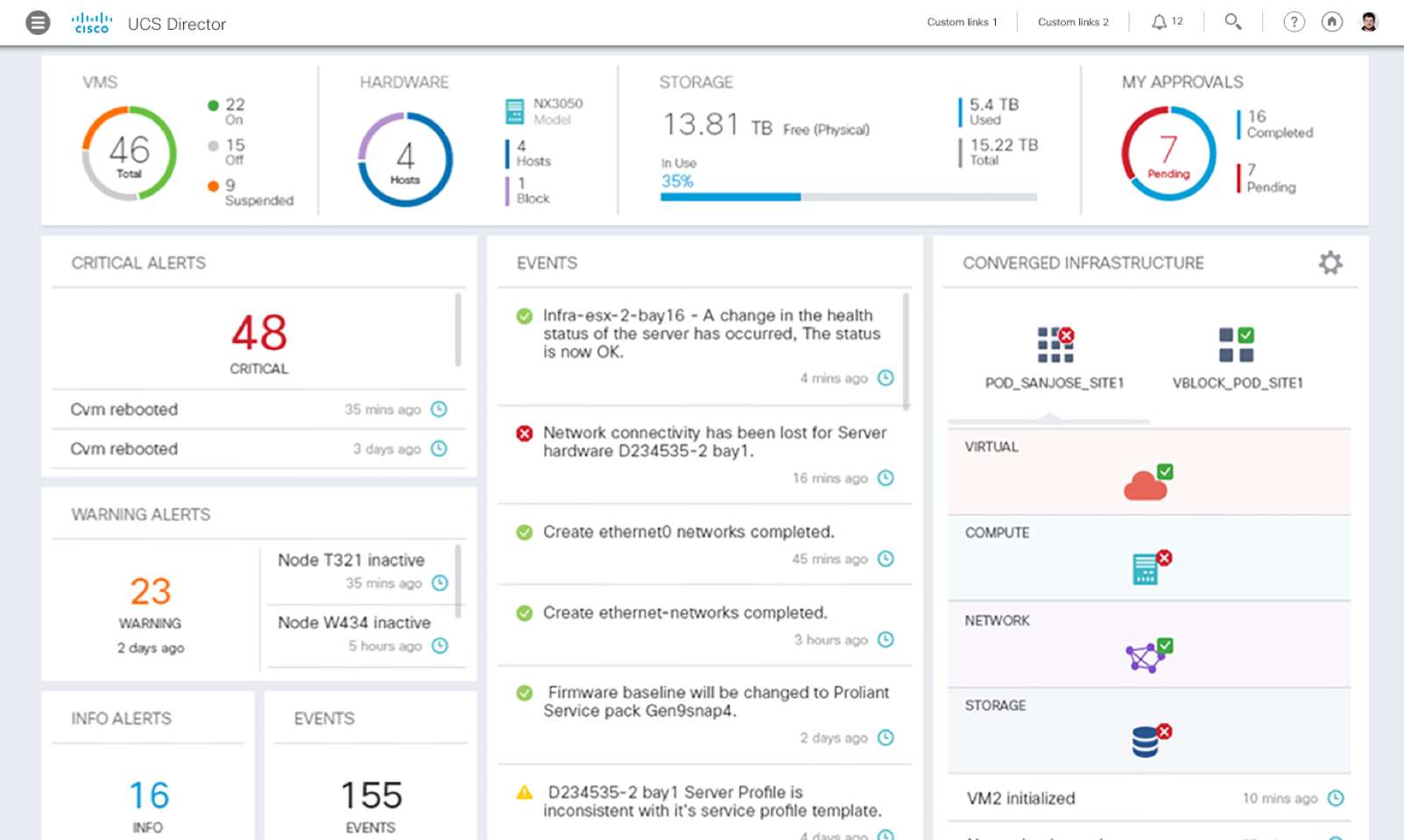
User gets a high level rollup of the health of the infrastructure and list of real-time events and alerts.
Information displayed in screens is guided by the user role.
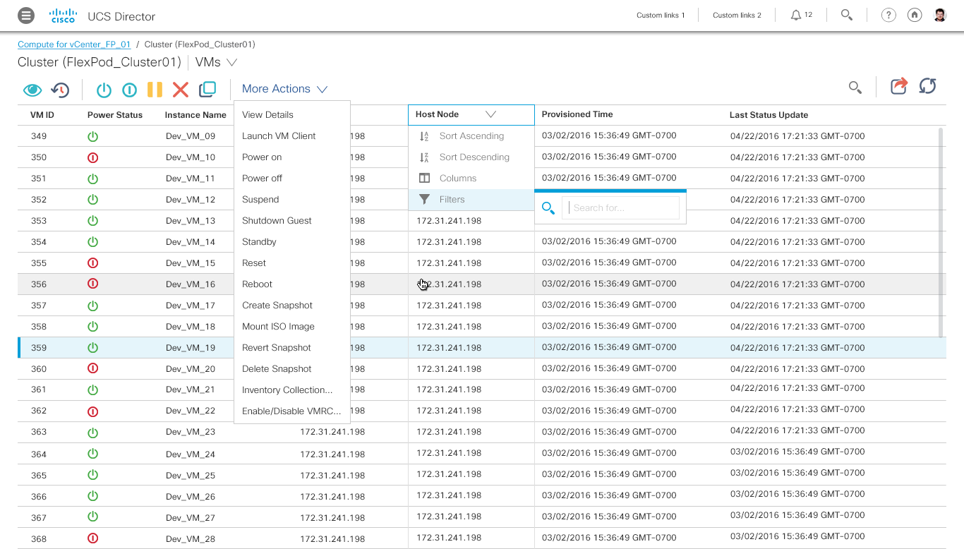
Infrequently used and advanced actions are hidden in the “More Actions” dropdown. Table filters are inline in the column headers.
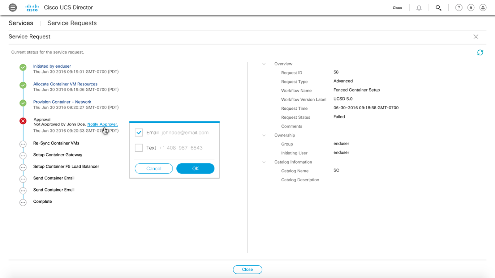
Inline Resolution links in the Error messages navigate directly to the solution.
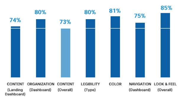
We built and usability tested clickable prototypes and rolled in user feedback in iterative updates. Here are some of the results.
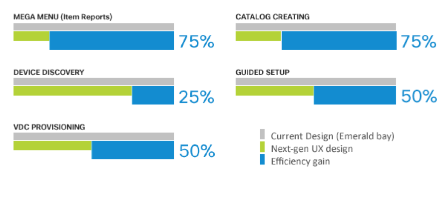
Next Gen UX Prototype Highlights
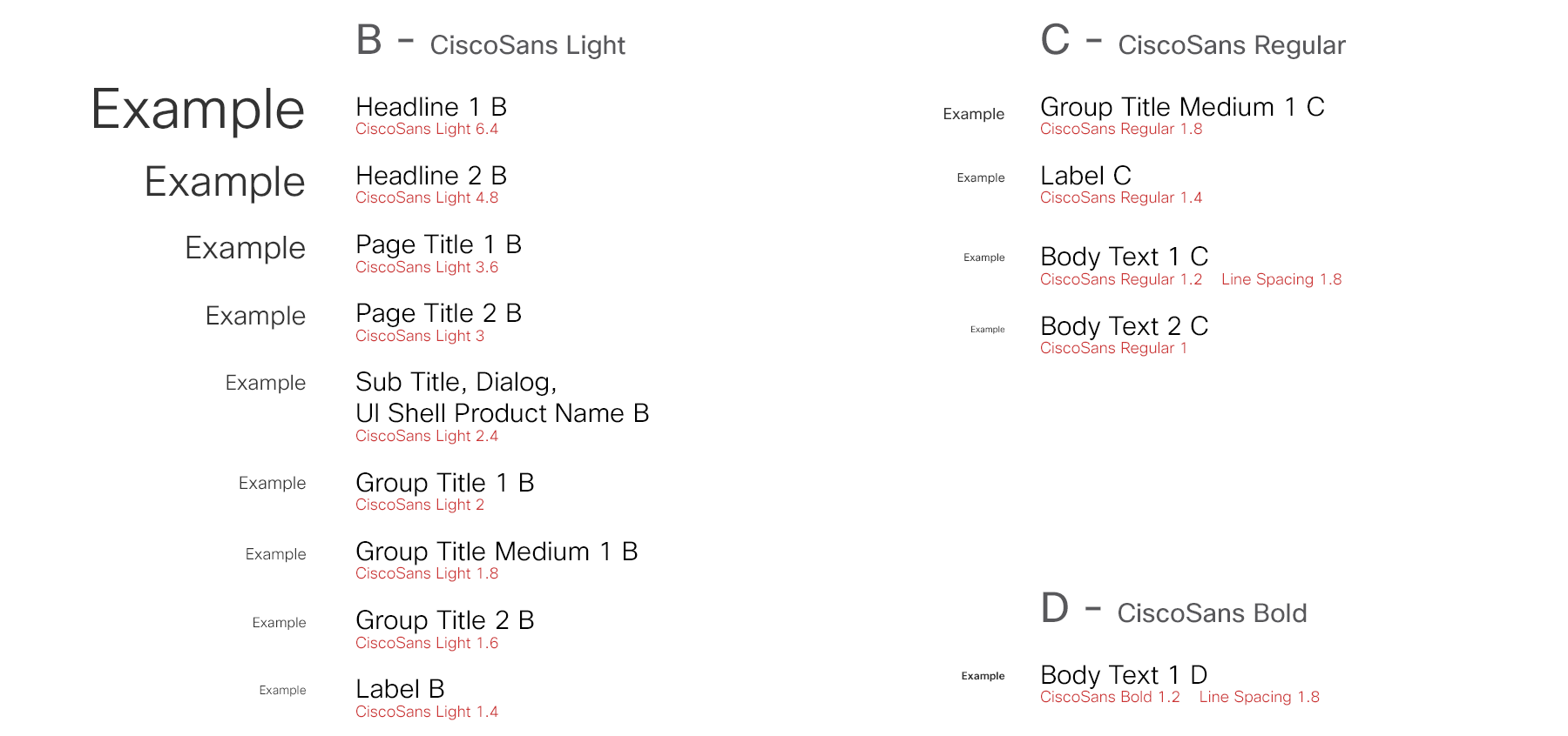
Next we focused on delivering design to development. The approach was to create modular patterns for all reusable elements like components, dialogs and page types.
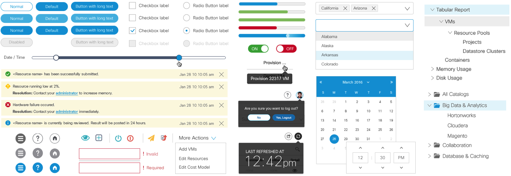
We designed a consistent layout and responsive grid structure for all the page types. Dashboard, Summary, Catalog master detail – tile, list, master-detail with tables and summary details.

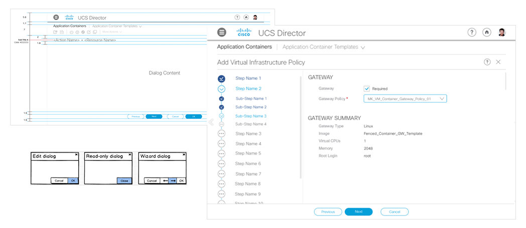
In sync with flat material design, the dialogs were displayed inline instead of modal popups. Eg. Edit, Read only, Compound, Wizards.
A minimum amount of colors, separators and patterns are used, so the user can focus on the data. The fact that it is an IT product, red, yellow and green is reserved for alerts and statuses. We decided to go for white and grey with blue for highlights in the main structure.

To make the data more comprehensible we introduced visualizations through Charting libraries – Sencha and D3 libraries.