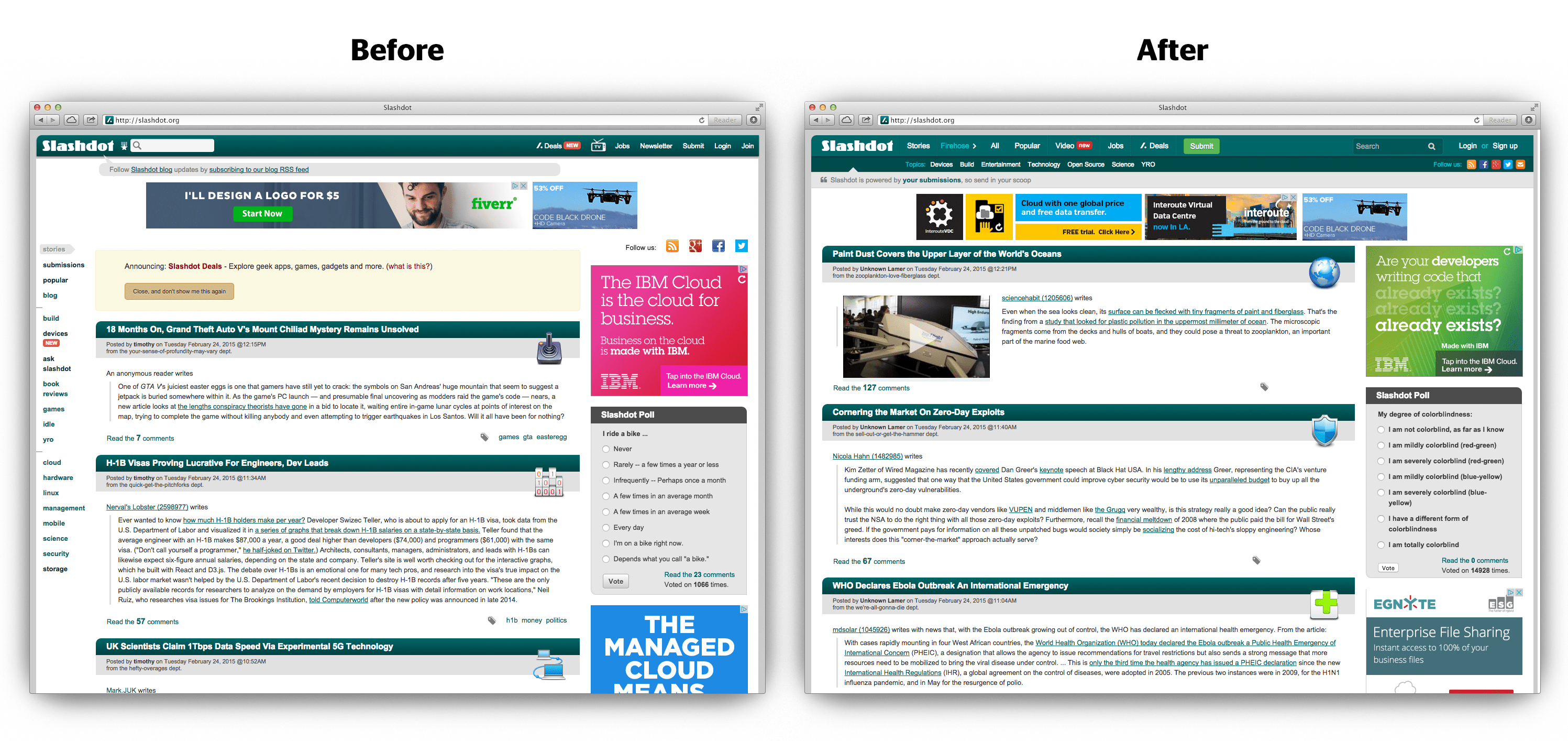
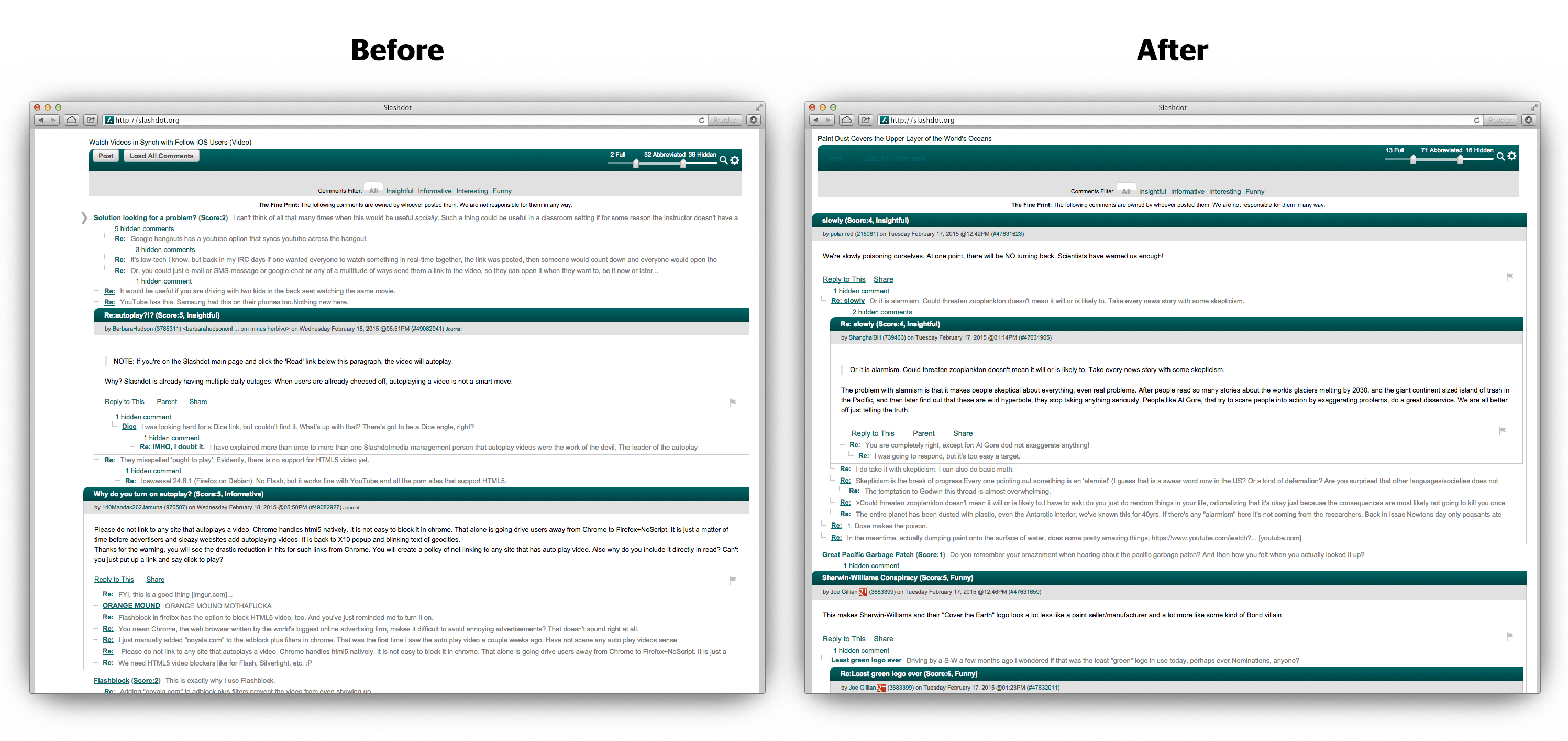
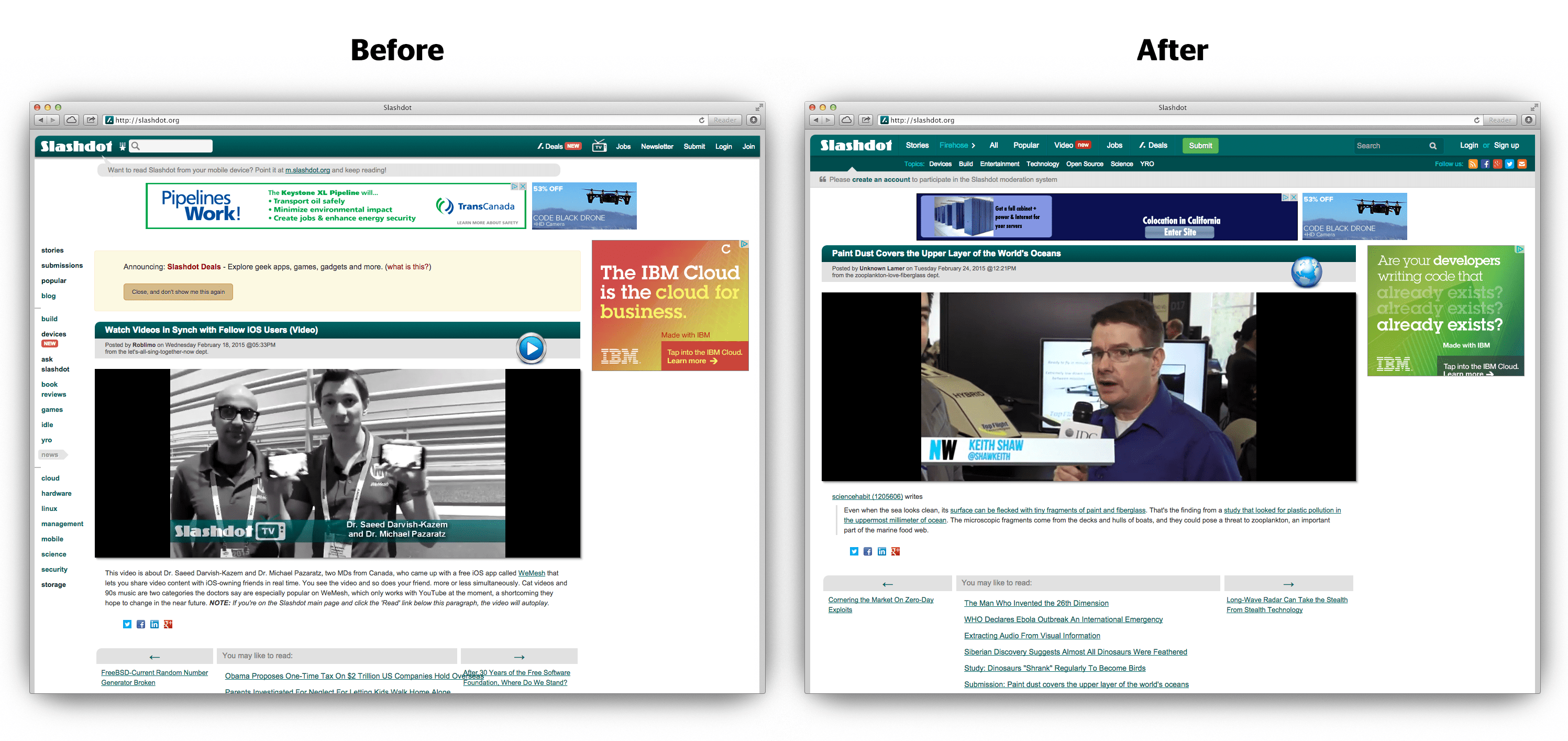
Slashdot.org (sometimes abbreviated as /.) is a news website that originally billed itself as "News for Nerds. Stuff that Matters". It features news stories on science and technology that are submitted by its users. Each story has detail page and a comments section and add to favorite or share with other social network.

Slashdot is over 19 years old website, admin and editors are very important of our users. But interface never had been update before. Mobile and other device became higher usage, Slashdot didn’t support mobile friendly website. Overall contents and complicated UX / UI.
Suggest new layout, flat design style, implement and reorganize based on percentage of the user uses, who regularly visit and create online content.
Simplicity and ease of use and hold user’s interest were of paramount importance goal. And kept abreast of industry responsive web design trends.
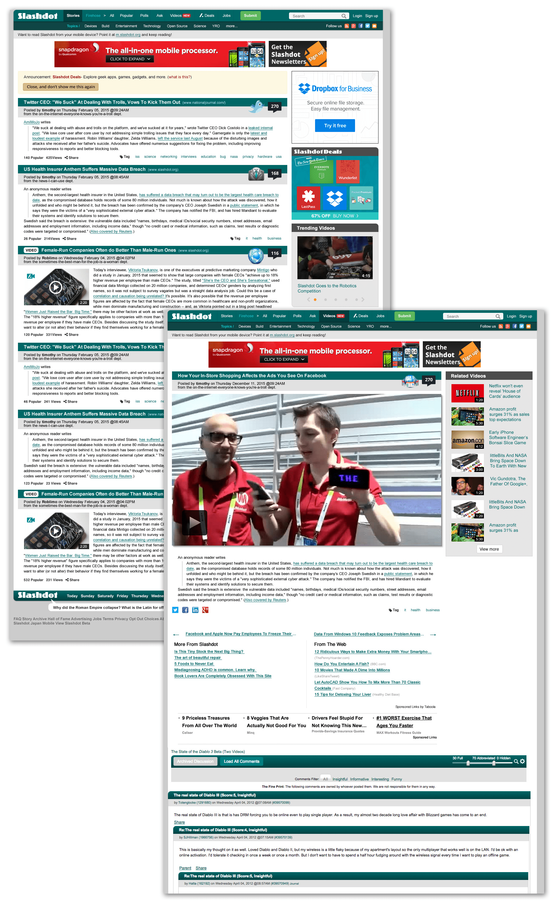
Main Page, Story Detail Page, Polls Main and Detail Page, Submission Page (Firehorse), Askslashdot, Slashdot Video were updated with 16 grid structure and new style. After several wireframing session, determined with PM and engineers which options best solved the problems. Created high fidelity prototypes.
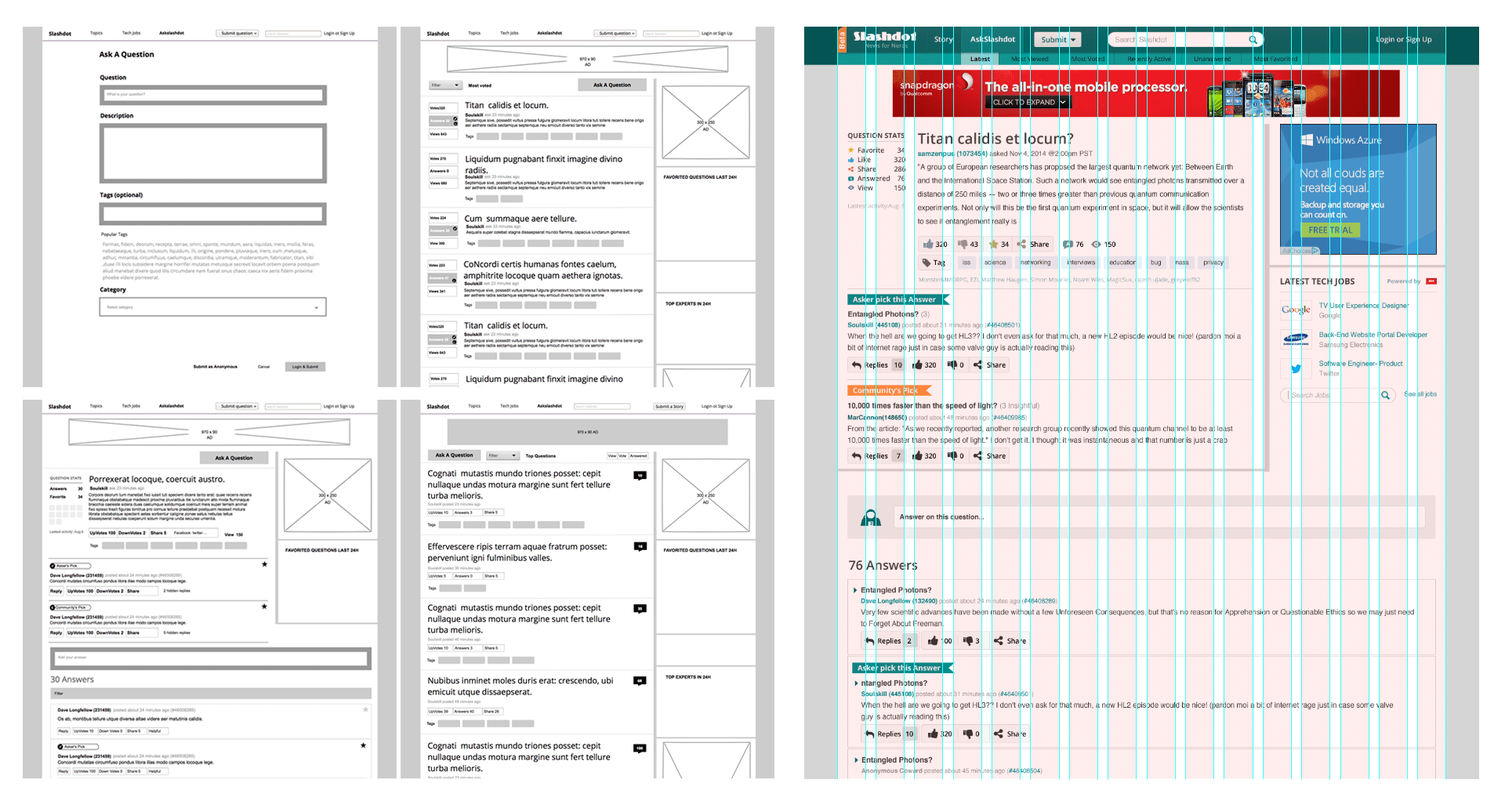
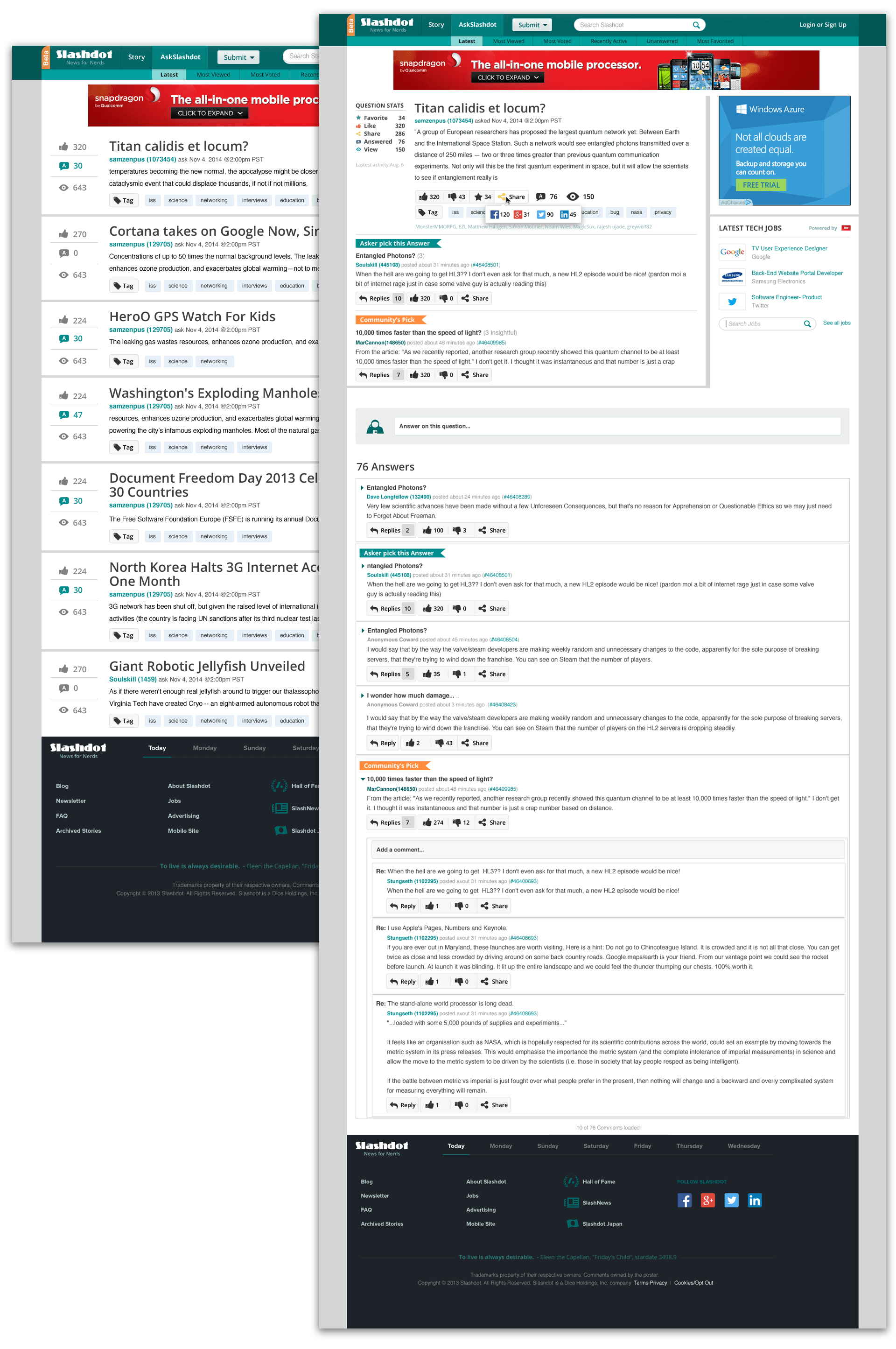
AskSlashdot is new feature, user can submit questions and anwers. User can share with social media and mark as like or favorite.
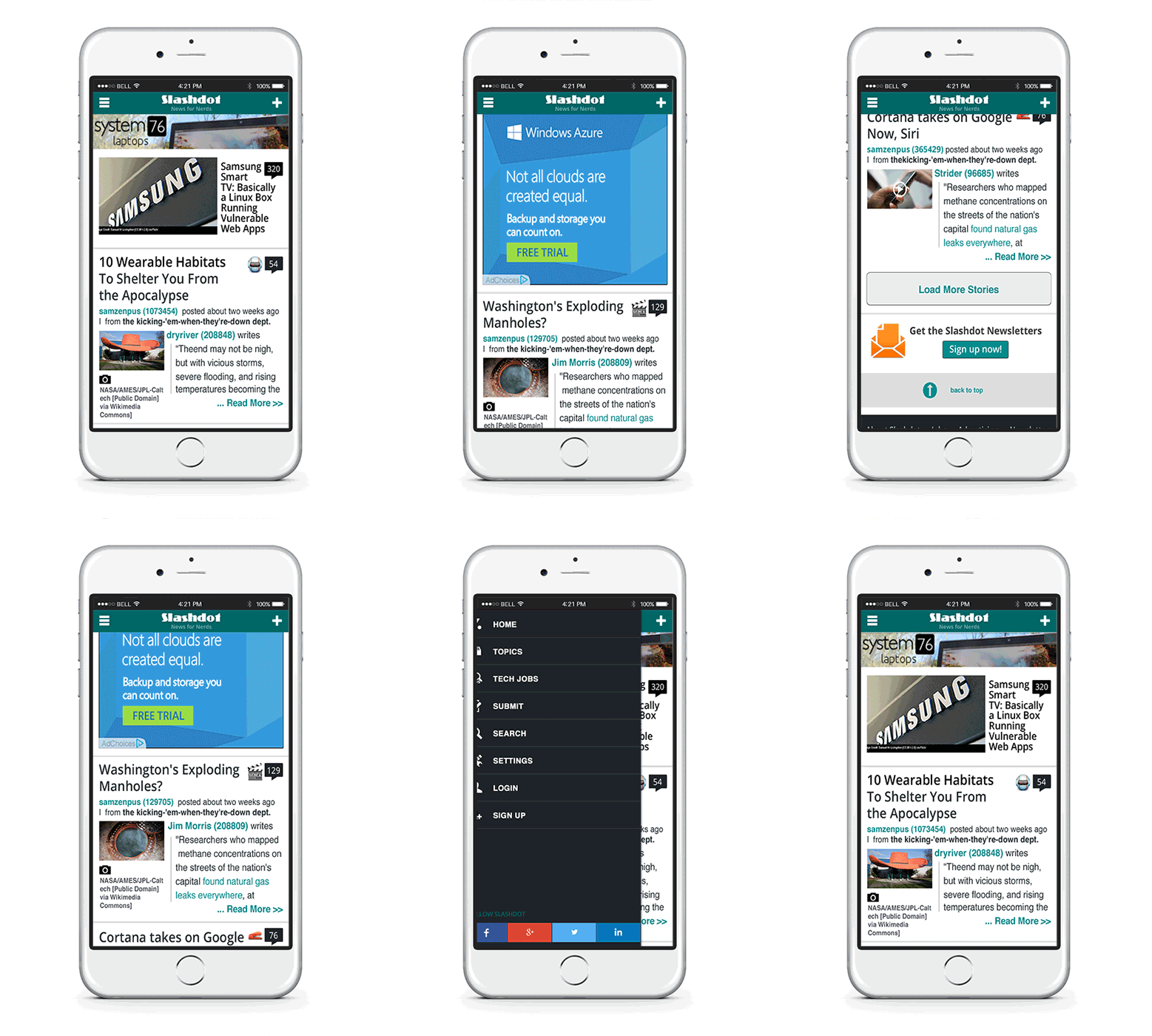
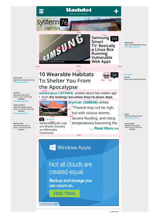
Concentrated on growing population of mobile users we updated mobile Slashdot design.
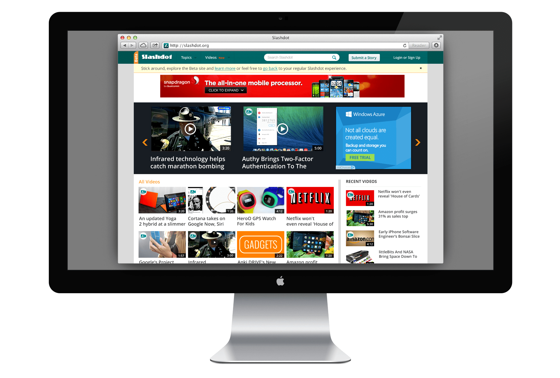
Videos is an untapped area for Slashdot as viewership of online videos has increased. This was new feature to focus to increase user engagement and revenue.
Main users, who used to visit slashdot 19 years, prefer old layout even complicate to use. We decide to go back to old design but keep our design goal.
